
Design is very often overlooked in daily life – one place in particular is in our drinks. Lately, a lot of soda can designs have been popping up – may they be real, fake, or faux. Here are a few designs to sip on during your lunch break:
Diet Coke Gets a Facelift
This can design was proposed by Turner Duckworth, an agency already familiar with the Coca-Cola brand. The approach is simple – less is more. Our culture has grown up with Coca-Cola products, and the distinct silver can with red and black text on it has become a staple in our everyday lives. Even at this angle, you can still grasp the Coke branding.
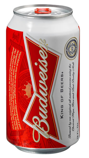
 Bows for Budweiser
Budweiser gets an actually implemented facelift, earning it’s bow-tie and moving up a rank from the cheap party beers to the sophisticate level. As with Coca-Cola, Budweiser has come a long way from where it’s packaging started, but maintains brand loyalty with its bold red color and crown. The red pop-tab adds a nice touch to the can as well.
Read more about this design and vote it up or down @ Under Consideration
And then there’s … is that a can?
Threadless designers submit wacky t-shirt designs for those to wear proudly on their chests for the day, but have you ever seen an approach like this? Designer David Schwen took timeless characters and put them on a can. The minimalist approach takes great shape on these cans. Can you name all the characters shown here? Take a second – no? Here’s a cheat sheet:
From left to right, top to bottom. Bart Simpson, Mario, Pacman, R2D2, Superman, Pokemon, Mickey Mouse, Cookie Monster, and Charlie Brown.
Has anyone seen Prince Albert…?
Share your thoughts with us! Have you seen other cans that have stuck with you?