Fairfield Country Day School
Re-brand: Brand Identity | Brand Standards | Advertising | Digital Media
OVERVIEW
FCDS wanted to change their recruitment strategy, starting by reinventing the school identity to better serve today’s young men. milk* developed a new brand narrative and modern identity to serve as guiding principles for every touchpoint moving forward. Prospective parents quickly became aware of the many benefits of an all-boys education, while students felt a sense of pride in the ethos of their newly positioned school.
HIGHLIGHTS
Rebranded the school logo & mascot
Launched the new campaign “Preparing Boys to Meet the Moment”
Targeted prospects through digital media
Created a new asset library to be utilized cross-channel
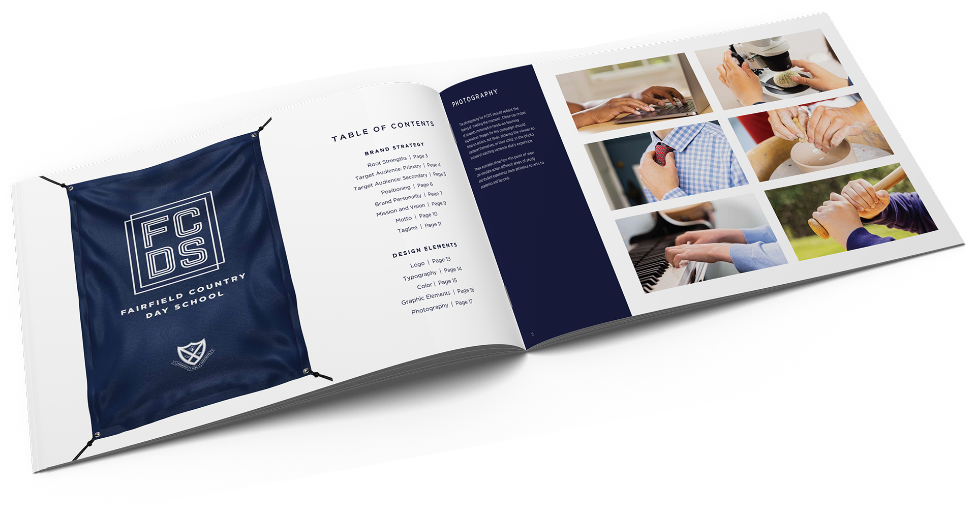
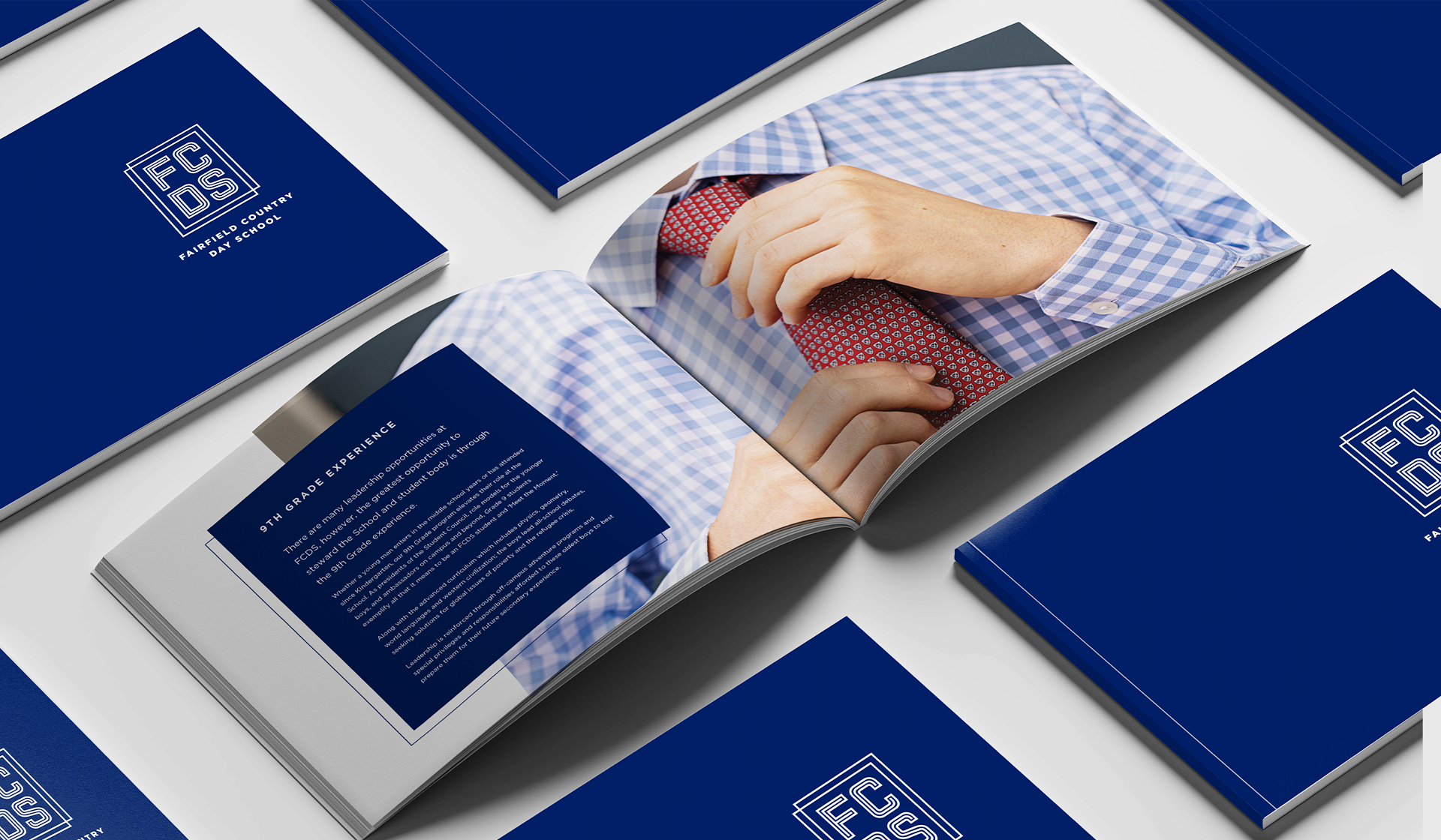
LOGO REDESIGN
SPORTS TEAM REDESIGN
BRAND STANDARDS

TYPOGRAPHY

Our brand font is Gotham.
This geometric sans-serif font is confident, structured, and modern. This versatile font can be typeset to feel playful, bold, or sophisticated, making it perfect to appeal to all our audiences from parents and students to alumni and donors.
Here is an example of text styles used on a print ad curated to evoke the confidence and approachability of the FCDS brand.

PRINT MATERIAL


DIGITAL ADS


PROMOTIONAL ITEMS